1. Introduction
Picking up where we left off, the Label control is arguably the simplest UI component. I once thought TextEdit was the easiest, but after diving deep into custom controls, I realized how complex TextEdit truly is. Building a TextEdit from scratch with all its basic features is quite a challenge.
2. The Base Class
To keep things simple, we’ll use an Object-Oriented Programming (OOP) approach to build our control system. A common point of debate here is whether game objects and UI controls should share the same base class. Let’s compare the two design philosophies:
Design Approaches
| Design Option | Unified Base Class (Entity) | Layered Design (Separate UI/GameObject) |
| Structural Simplicity | ✅ Consistent | ❌ Requires a bridging interface or separate dispatching |
| Code Clarity | ❌ Unclear responsibilities | ✅ High cohesion, low coupling |
| Future Scalability | ❌ Hard to manage field growth | ✅ Can be extended independently |
| System Management | ✅ Simple | ✅ Simplified via interfaces |
| Recommendation | ❌ Not recommended | ✅ Recommended |
As you can see, both approaches have their pros and cons. To keep our process simple and easy to follow, I’ve chosen a unified base class but with some modifications. The class structure is shown below:

3. Fonts
To render text, we need to set a font for our rendering class. This must be a TTF font. The example code uses the common Arial.ttf font. Note: This example does not implement a multi-font manager, which is a good exercise for you to try.
4. Key Properties of Each Class
Node As the base class for all game objects, its properties should not be too complex. Currently, it has the following attributes:
- Position: Relative position to its parent.
- Size: The size of the object’s rectangular area in the logical layout.
- Parent Node: The logical parent.
- Child Nodes: The logical children.
- Visibility: Whether the object should be rendered.
- Enabled/Disabled: Controls the active state of the node.
UIControl This is the base class for all UI controls. It currently has these properties:
- Text-related: Content, color, font size.
- Background Color
- Control State: Normal, Hover, Pressed.
UILabel With the base classes in place, this class is quite straightforward and doesn’t require any additional members. It simply overrides the Render function.
Here is the final UILabel implementation:
C++
class UILabel : public UIControl {
public:
    UILabel() = default;
    UILabel(const std::string& text);
    ~UILabel() = default;
    void Render() override;
};

UILabel::UILabel(const std::string& text)
{
    m_text = text;
}

void UILabel::Render()
{
    //draw background
    auto pos = GetGlobalPosition();
    SDL_Rect rect = { pos.x, pos.y, m_size.x, m_size.y };
    sRender->FillRect(rect, m_backgroundColor);
    //By default we draw the text to the center
    sRender->DrawString2(m_text.c_str(), m_fontSize, rect, m_textColor);
}
This design is not set in stone and will evolve as new requirements emerge.
5. Application in the Example
All we need to do is define the control variable in our scene class and instantiate it during the scene’s initialization. Here’s how we apply it in our LaunchScene class:
C++
std::shared_ptr<UILabel> m_lb;

bool LaunchScene::init()
{
    m_lb = std::shared_ptr<UILabel>(new UILabel("Hello World!"));
    m_lb->SetPosition({ 100,200 });
    m_lb->SetSize({ 100, 50 });
    m_lb->SetBackgroundColor(SDL_Color{255,0,0,255});
    AddNode(m_lb);
    return true;
}
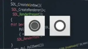
Final result:

You can find the complete project example here: https://github.com/84378996/simple_sdl_gui_tutorials/tree/main/tutorials02
Key Takeaways from This Article:
- How to use SDL_ttf to render text.
- How to encapsulate text rendering into a custom UILabel control.
- How to integrate UI controls into the SDL rendering loop.
In the next article, we’ll continue by implementing UIButton to add interactive click functionality for users!